
The Mazda Logo – How It Changed Automotive Manufacturers
This post contains affiliate links. As an Amazon Associate, we earn from qualifying purchases.
The Mazda logo is the official brand mark for Mazda, a company that began as a cork manufacturer and changed into an automotive manufacturer. The current logo, a stylized “M” wing, was established in 1997 and is governed by strict design rules covering size, color, and placement. Its most dramatic story isn’t about design, it’s about a 2021 safety recall where the steering wheel logo in certain Mazda3 models could shatter during an airbag deployment.
That last point isn’t marketing. It’s from a federal report. The logo on a 2004 Mazda3’s steering wheel was made of a specific plastic that degraded over time. When the airbag blew, it turned the emblem into plastic shrapnel. Mazda changed the material in 2006, but the older cars stayed on the road for years before the official recall. A badge is more than a pretty picture. It’s a piece of the car, with a material spec and a failure mode.
What follows: the evolution from cork to wings, the exact rules that protect the logo’s look today, and the engineering story where a badge became a safety component. By the end, you’ll read any car logo as a design and a part number.
Key Takeaways
- The current Mazda “winged M” logo debuted in 1997, symbolizing continuous growth and openness, not speed.
- Official guidelines mandate a minimum digital size of 44 pixels and a clear space around the logo equal to 1/6 of its width.
- A 2021 recall affected 2004-2007 Mazda3 models because their steering wheel logos, made of polyurethane, could shatter during airbag deployment.
- The supplier quietly changed the logo material to polyester in June 2006, which fixed the problem for later models.
- For accessories and packaging, Mazda specifies the Frutiger font family and colors like PMS Process Blue and Symbol Silver.
From Cork to Wings: How the Mazda Logo Evolved
The Mazda logo didn’t start on a hood. It started on a cork. The company was founded in 1920 as Toyo Cork Kogyo. The first vehicle, the Mazda-Go three-wheeled truck of 1931, wore a simple script logo. But the first emblem that hinted at the future was the 1936 “winged M.”
That design was a direct nod to Hiroshima. It incorporated three stylized “M” shapes representing “Mazda Motor Manufacture” into a pattern inspired by the city’s emblem, which depicted the flows of the Ota River delta. The elongated lines were meant to suggest wings, symbolizing agility and rapid development. This emblem lasted until 1959.
The 1959 logo sharpened the focus. It was a clean, stylized letter “M,” dropping the explicit Hiroshima reference. This badge saw Mazda launch its first passenger car, the R360 Coupe, in 1960.
Then, for nearly two decades, Mazda used no emblem at all. From 1975 to 1997, the brand relied solely on a distinctive wordmark. The blocky, lowercase “mazda” with a slashed “Z” became iconic on cars like the RX-7 and first-generation MX-5. It was a pure typographic identity.
The 1991 logo, a diamond shape in a circle, was scrapped after just a year because it looked too much like the Renault logo. Mazda smoothed the diamond’s edges for 1992, but it was a temporary fix.
The stage was set for a unified symbol. The company needed to bring its various sales brands back under one global identity. The solution arrived in June 1997.
The 1997 Brand Mark: Mazda’s Current Logo
The Mazda logo you see today is not an emblem of speed. Read the official brand guidelines. The wing-shaped “M” is called the Brand Symbol. It represents continuous self-reform and growth. The “V” motif inside the “M” stands for openness, creativity, and vitality.
It’s always used with the wordmark “Mazda” in a specific, locked configuration. You never see the wing by itself as the car’s badge. This combination is the Mazda Brand Mark.
The design is meant to be timeless, not trendy. It doesn’t scream “fast car.” It whispers “thoughtful progress.” That alignment with Mazda’s later “Kodo: Soul of Motion” design philosophy is no accident. The logo had to embody a mindset that was already forming.
Official Rules: Sizes, Colors, and Clear Space
Mazda guards its logo with precise, non-negotiable rules. These aren’t suggestions; they’re specifications for anyone who works with the brand, from web developers to parts suppliers.
Digital Use: The Mazda Digital Platform Style Guide sets a hard floor. The logo must be at least 44 pixels in height. Any smaller, and it loses legibility and impact.
Clear Space: This is the non-negotiable empty zone around the logo. No text, graphics, or borders can intrude. For the Brand Symbol, the clear space on all sides must equal at least one-sixth of the symbol’s width. Think of it as a buffer zone that keeps the logo visually clean.
Colors: You can’t just pick a blue. The official brand symbol colors are defined by specific Pantone (PMS) codes: * Symbol Silver: PMS 877C * Mazda Blue: PMS PROCESS BLUE C100% + M30% * Symbol Gray: PMS COOL GRAY 7C * Black and White
For two-color printing, the approved combination is Black and PMS Process Blue. The guidelines are also explicit about what not to do: using metallic ink on uncoated paper is not recommended.
Typography: For all genuine accessories and packaging, the mandated font is the Frutiger family. This ensures readability and a unified look across every box and label, whether it’s for a floor mat or a roof rack.
| Rule Category | Key Specification | Purpose / Consequence if Ignored |
|---|---|---|
| Digital Size | Minimum 44 pixels | Prevents loss of detail and brand dilution on screens. |
| Clear Space | 1/6 of logo width on all sides | Protects visual integrity; crowded logos look amateurish. |
| Primary Colors | PMS 877C (Silver), Process Blue, etc. | Maintains consistent brand recognition across all media. |
| Packaging Font | Frutiger typeface | Unifies global accessory branding for instant recognition. |
Where this goes sideways: Printing the logo with metallic ink on uncoated paper. The ink doesn’t adhere correctly, leading to a smudged, unprofessional finish that violates brand standards immediately.
These rules exist because consistency builds recognition. Whether you’re looking at a dealership sign, the BMW X3 drivetrain configurator page, or a Toyota 4Runner drivetrain brochure, the logo should feel exactly the same. That control is the point.
A Logo That Could Shatter: The 2021 Recall
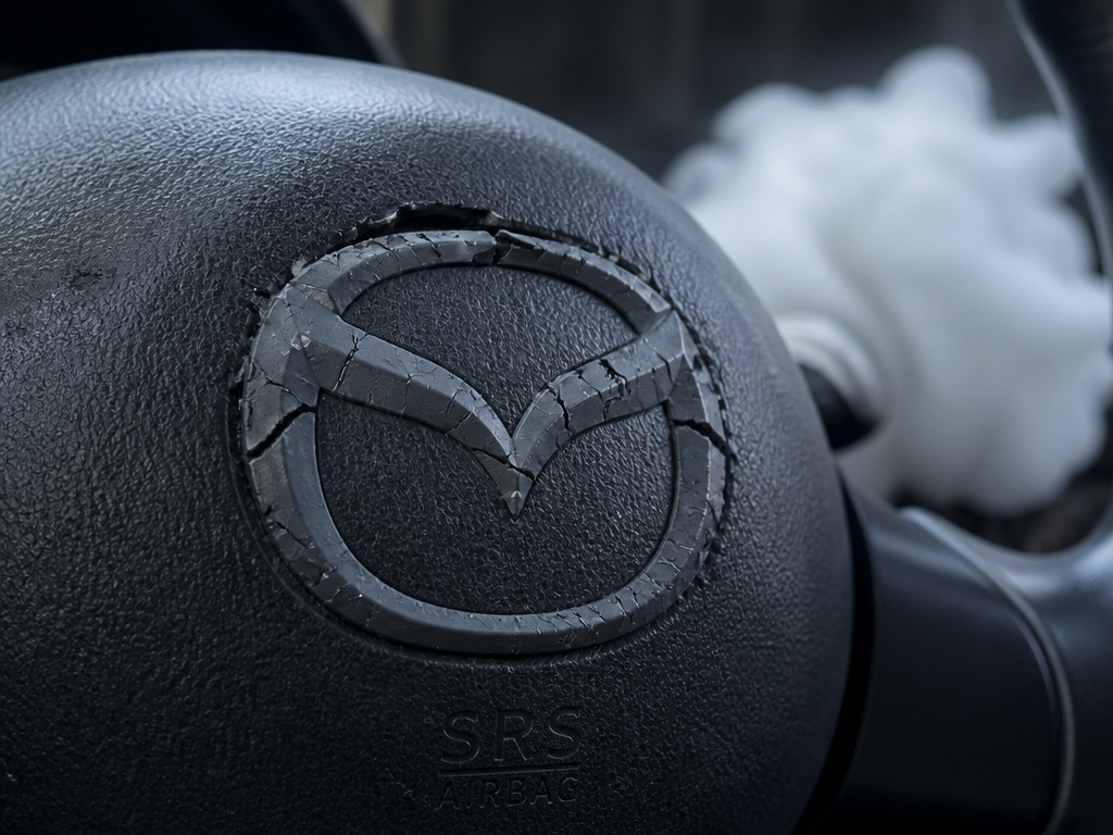 Sometimes a logo stops being a mark and becomes a mechanical component. Its material matters. This is the story of NHTSA Safety Recall 21V-494.
In certain 2004 through 2007 Mazda3 models, the Mazda logo on the steering wheel was made of polyurethane. Over time, especially in high heat and humidity, this plastic underwent hydrolysis, a chemical breakdown that made it brittle.
The problem? That logo was mounted directly over the driver’s airbag.
During deployment, the explosive force could shatter the brittle logo, sending plastic fragments into the cabin. The NHTSA defect chronology report details the timeline: the first injury report came in September 2015. Mazda and its supplier investigated, confirming hydrolysis in the polyurethane by February 2016.
Then they found a crucial fact. The supplier had changed the logo material from polyurethane to polyester in June 2006, originally to improve its appearance. Polyester doesn’t suffer from hydrolysis. This change, made mid-production, accidentally fixed the problem for later 2006 and all 2007 models.
| Vehicle Model | Model Years Affected | Defective Part | Root Cause | Corrective Action |
|---|---|---|---|---|
| Mazda3 | 2004–2007 (early production) | Steering Wheel Airbag Logo | Polyurethane material degradation (hydrolysis) | Replace airbag module cover (logo assembly) |
| Mazda3 | 2006 (late production)–2007 | Steering Wheel Airbag Logo | Polyester material (inherently resistant) | No action required; built with corrected part |
Despite injury reports from outside the U.S. Starting in 2015, Mazda initially deemed the risk low. More reports trickled in, an injured arm in 2018, injured faces in 2018 and 2019. Finally, after ten field incidents and U.S. Lawsuits, Mazda issued a formal recall in June 2021.
The recall wasn’t about the logo’s design. It was a material science failure. That small badge had a part number, a bill of materials, and a specific chemical vulnerability. It’s a stark reminder that every piece on a car, even the decorative ones, has a functional spec.
Logo Usage in the Real World: Accessories and Branding
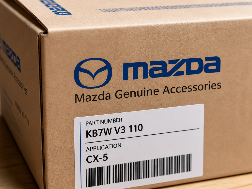 For Mazda Genuine Accessories, the logo rules get even more granular. The packaging is a branded experience, and every detail is dictated.
The standard accessory carton or tube is 4 inches by 2 inches. It must display the specific “Mazda Genuine Accessories” logo in Mazda blue and black. The part number, description, quantity, and application (e.g., “CX-5”) are mandatory. Even the barcode is specified: it must be Code 39 format (ISO/IEC 15388 standard) with Mod 43 check digits.
This rigor ensures a parts clerk in Germany and a service advisor in Canada are looking at the same, unmistakable packaging. It reduces error and reinforces the premium brand at every touchpoint, much like the specific engineering that defines a Jeep Grand Cherokee drivetrain or the Audi Q3 drivetrain.
Easy to miss: The clear space rule applies to packaging, too. That 1/6-width neutral zone keeps the logo legible even on a small parts bag, preventing other text from crowding it.
Why does this level of control matter? It turns a commodity transaction, buying a cargo liner, into a brand-consistent experience. The unboxing feels official, trusted, and part of the ownership loop. That meticulousness is a brand hallmark, as identifiable as the wing symbol itself.
Frequently Asked Questions
What does the current Mazda logo symbolize?
According to Mazda’s own Brand Style Guidelines, the wing-shaped “M” Brand Symbol represents continuous self-reform and growth. The “V” motif within it stands for values like openness, creativity, and vitality. It’s a mark of philosophy, not merely speed.
Has the Mazda logo changed since 1997?
The core Brand Mark, the combination of the winged symbol and the “Mazda” wordmark, has remained unchanged since its introduction in June 1997. Its applications and finishes have evolved (like using more matte textures), but the fundamental design and rules governing its use are stable.
What was the Mazda logo recall about?
In 2021, Mazda recalled certain 2004-2007 Mazda3 vehicles because the polyurethane steering wheel logo could degrade and shatter during airbag deployment, potentially causing injury. The material was changed to polyester in mid-2006, fixing the issue for later production.
What are Mazda’s official logo colors?
The primary brand symbol colors are Symbol Silver (PMS 877C), Mazda Blue (PMS PROCESS BLUE), Symbol Gray (PMS COOL GRAY 7C), Black, and White. For two-color printing, Black and PMS Process Blue are specified.
Can the Mazda logo be used by itself?
No. The official rule is that the Brand Symbol (the wing) and the Corporate Script (the word “Mazda”) must be used together in a fixed configuration. You do not see the winged symbol alone as the vehicle’s badge.
The Bottom Line
The Mazda logo is a contract. The 1997 wing design is a promise of thoughtful growth. The style guides are a contract for visual consistency. The 2021 recall is a brutal lesson that a logo is also a physical part with material responsibilities.
It’s not a static sticker. It’s a designed element with pixel dimensions, Pantone codes, chemical properties, and a mandated empty space around it. This depth separates a corporate asset from a drawing. From the script on a three-wheeled truck to the regulated badge on a modern SUV, the logo has mirrored the brand’s journey from a cork factory to a global automaker. Every time you see that winged “M,” you’re seeing a century of change, codified into a single, protected mark.
